In 2019 the volatility environment for our active derivatives portfolios (also known as our ‘short volatility’ portfolios) has rotated between two states:
Benign volatility as the U.S. economy continues to defy recession expectations and churns out steady, moderate growth - a very good scenario for harvesting volatility risk premium the way we do.
Bursts of volatility as surprise escalations of the U.S. - China trade war inject uncertainty into expectations for the future of the economy - a scenario which can quickly cause our derivative market stress indicator to turn bearish and wait for the volatility environment to improve.
In a previous post we described the gains our portfolios delivered in early 2019, after our derivative market stress indicator turned bullish in late January. The first of 2019’s surprise China trade war escalations came in May and hurt returns in that month before causing our portfolios to turn bearish until late June.
In June, volatility turned benign again and our portfolios were back to bullish and harvesting volatility risk premium. Then on July 31st, the U.S. Federal Reserve lowered interest rates as well as terminated early its balance sheet reduction program, known as quantitative tightening. The announcement linked the moves to providing the U.S. economy ‘insurance’ against future uncertainty, and this was generally interpreted as being linked to the ongoing U.S. - China trade war.
U.S. equity investors didn’t take the news well that day, perhaps anticipating that this would give the U.S. administration the green light to escalate the trade war. Our indicator turned bearish as a result, and our active derivatives portfolios exited the short volatility position at market close on August 1st.
That same day, the U.S. did indeed escalate the trade war with an announcement of new tariffs, and over the weekend China immediately responded by halting U.S. agricultural purchases and devaluing its currency. This drove a further volatility burst on Monday August 5th.
The below charts show the two short volatility indices that our active derivatives portfolios trade. When our portfolios are in the bullish positioning, they gain in value as these indices increase in value. On these charts we point out the days on which the trade war escalations were announced. The color coding of the lines also shows what was the state of our derivative market stress indicator at the time.
Mid-term volatility ETF (ticker: ZIV) traded by our robo-advisor active derivative portfolios

Short-term short volatility index traded by our Titan and Sidereal short volatility portfolios

At the moment, our indicator remains bearish, and due to its design will remain in that state for at least several more days.
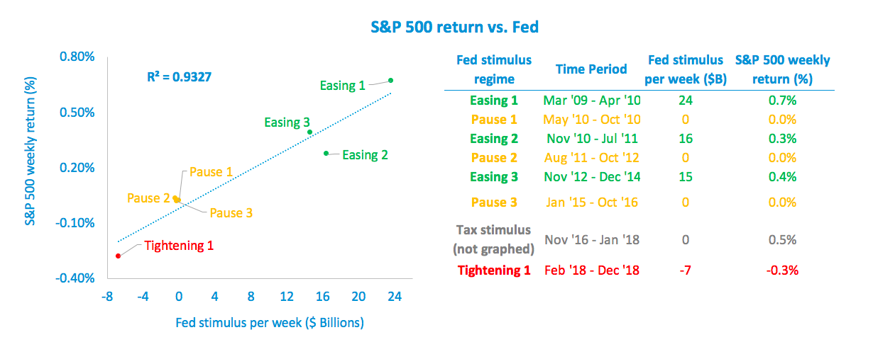
One final observation - the early termination of the Federal Reserve’s quantitative tightening program could be quite significant and positive for the U.S. economy, stocks, and the volatility regime. Read here for our analysis of the impact quantitative easing and tightening have had on stocks.