You’ve probably seen a chart like this one, showing the striking relationship of the S&P 500’s gains in the past decade to Federal Reserve stimulus phases 1, 2, and 3, known as ‘quantitative easing.’ But perhaps you’ve wondered if that relationship is just a coincidence.
Well, the fourth quarter of 2018 made clear it’s no coincidence.

We’ve marked periods on the above chart as easing, pause, and tightening, corresponding to whether the Federal Reserve was putting money into the economy, standing pat, or taking money out. Note we’ve also marked the ‘Tax Stimulus’ period, in which government economic stimulus was being applied, but not by the Fed.
Then we graphed these periods by average S&P 500 weekly return in each period vs. the amount of money each week the Fed injected into (or took out of) the economy in that same period, and ran a regression.
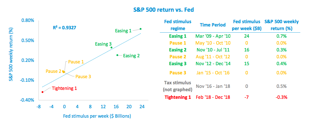
What’s clear is that Federal Reserve stimulus drove most of the S&P 500’s gains over the past 10 years, and tax cut stimulus drove the rest. With an R-squared of 93%, data scientists call this sort of relationship a slam dunk. Rarely is such correlation between cause and effect found in the real world.
Now that the Federal Reserve is unwinding its balance sheet and is reluctant to lower interest rates, what does this mean? Sustainable gains in equities are becoming more elusive, and protecting against volatility will be critical.